Image caption
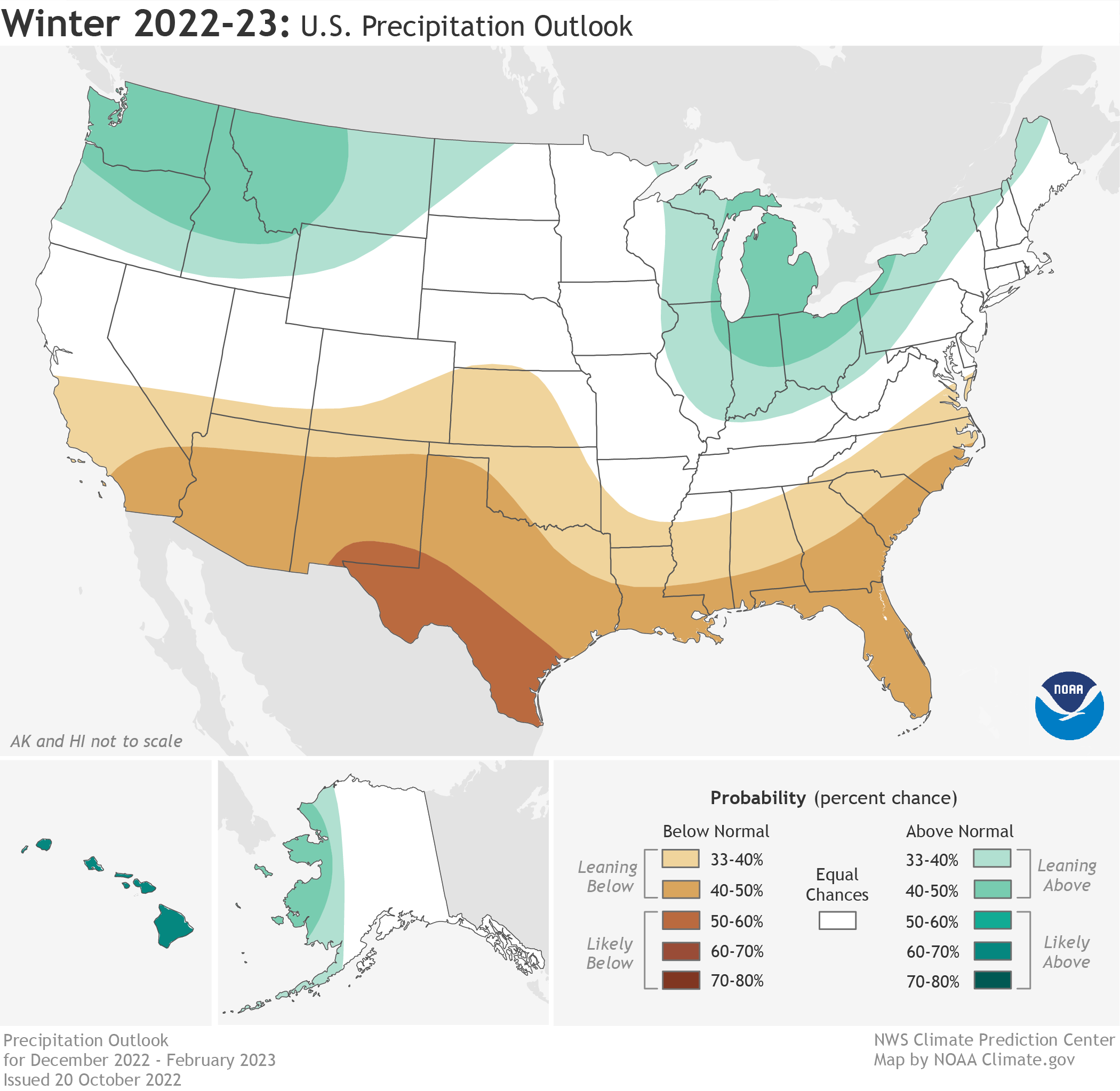
NOAA's winter precipitation outlook map shows which parts of the United States have elevated chances of either a much wetter than average winter (blue-green) or a much drier than average winter (brown). The darker the color, the higher the chance of that outcome. White areas mean that a relatively wet, dry, or average winter are all equally likely. NOAA Climate.gov map, based on data from the Climate Prediction Center.