Image caption
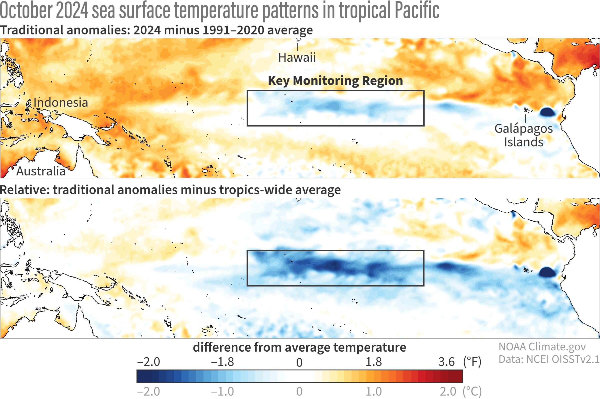
These maps show two ways of looking at the sea surface temperature anomaly (difference from average), with the Niño-3.4 key monitoring region indicated by the boxes. The top maps shows the traditional sea surface temperature anomaly: the departure of October sea surface temperature from the 1991–2020 average. For the bottom map, the average anomaly across the entire tropical oceans is also subtracted, highlighting how cool the Niño-3.4 region is relative to the rest of the tropics. Figure by climate.gov based on Michelle L'Heureux's calculations.