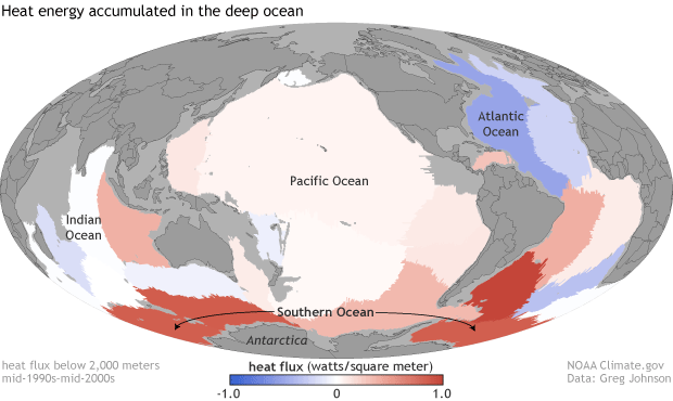
Image caption
Heat flux into the deep ocean (below 2,000 meters) between the mid-1990s and the mid-2000s, based on repeat ship cruise data. Places where the deep ocean gained heat are red; places where it lost heat are blue. NOAA Climate.gov map, based on data provided by Greg Johnson.